Best Practices in Healthcare Dashboard Design

In today’s data-driven world, healthcare organizations rely on dashboards to monitor and manage various aspects of their operations. A well-designed dashboard can provide healthcare professionals with the information they need to make informed decisions, identify trends, and improve patient outcomes.
However, not all dashboards are created equal. Poorly applied UI and UX design best practices in dashboards can be confusing and overwhelming and even lead to decision-making errors. That is why following best practices in healthcare dashboard design is essential.
Here, we are going to explore in detail the best practices that should be followed by UI and UX designers in healthcare dashboard design, including the benefits of healthcare dashboards, tips to design the best healthcare dashboard, etc.
What is a dashboard in healthcare?
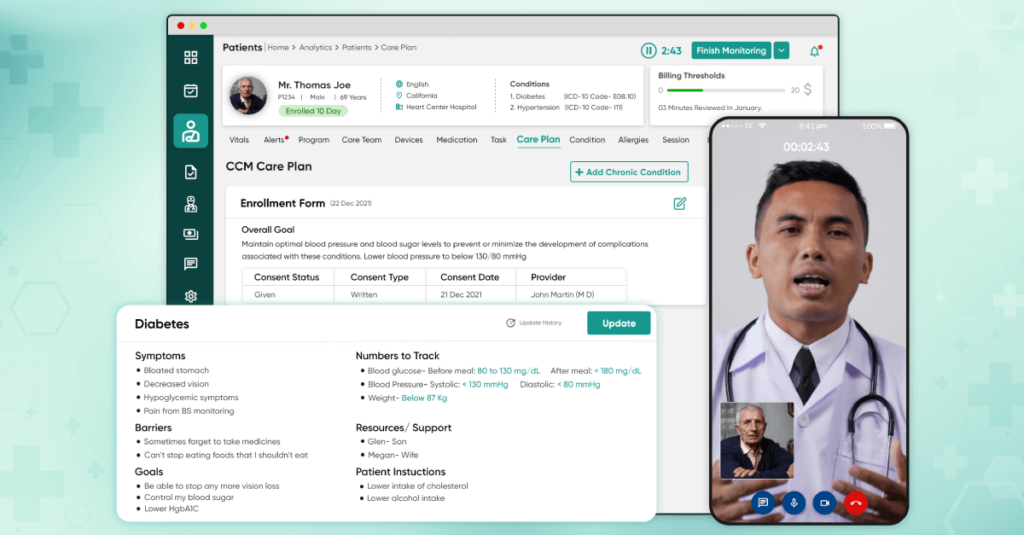
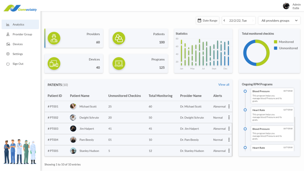
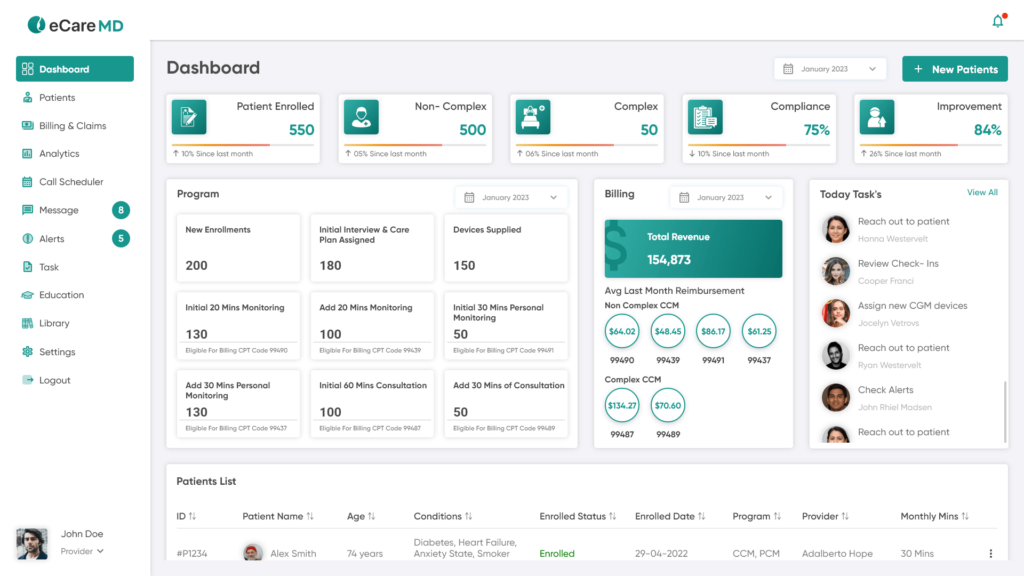
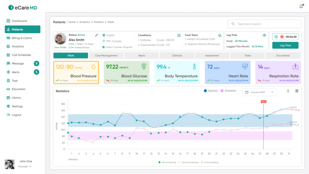
A dashboard is a tool through which healthcare organizations can monitor and control many areas of their operations using a dashboard. It focuses on the most critical data elements while presenting the information clearly and concisely. Furthermore, healthcare practitioners may quickly spot trends and patterns by employing color coding, graphs, and charts, which makes it simpler to identify areas that need attention.
A well-designed dashboard with UX design practices can offer insightful data and promote successful outcomes for patients and healthcare organizations. For instance, if readmission rates at a hospital are rising, a dashboard can assist medical staff in finding and resolving the issue’s source.
Dashboards focus on the most critical data points and convey crystal-clear information. They should have a logical layout and navigation that is intuitive and user-friendly. The information that healthcare professionals want should be simple to locate and understand.

Benefits of healthcare dashboard
A healthcare dashboard is a powerful tool that can benefit healthcare organizations.
One of the primary benefits of providing critical information clearly and concisely, healthcare dashboards can help improve patient outcomes, reduce costs, and increase efficiency. For instance, a well-designed dashboard can help organizations allocate resources more effectively, reducing waste and improving the bottom line.
Similarly, dashboards can help improve patient outcomes by enabling healthcare professionals to quickly identify and address emerging issues. Thus, by providing critical information clearly and concisely, dashboards can help healthcare professionals make informed decisions that could improve patient outcomes.
Dashboards can also help improve communication and collaboration among healthcare professionals. This can help reduce errors and improve efficiency, as healthcare professionals can work together more effectively.
Healthcare dashboards can provide many benefits to healthcare organizations, including improved patient outcomes, reduced costs, and increased efficiency. Also, it helps healthcare professionals to provide decisions for the betterment of patients.
Best Practices in Healthcare Dashboard Design
Generally, there can be too much information. Information overloads on medical dashboards can occur quickly, which affects how user-friendly they are. One of the essential elements of medical dashboard UI design and UX design best practices is including a manageable quantity of indicators.

Here are a few critical pointers for dashboard UI design:
- Keep the dashboard simple and uncluttered, with a clear hierarchy of information. Presenting prominent critical data points will help users see them more easily. Any medical dashboard should present pertinent data that is simple to comprehend. Users need help to obtain and share data because of complex dashboard designs.
- Use color coding, graphs, and charts to highlight important information and trends. When selecting colors and design themes for your medical dashboard. Keep things straightforward. Contemporary-looking dashboards are the future. Consider a simple design with a lot of white space. You can either stick with the official company logo colors or choose an entirely new color approach. Be consistent in all you do.
- Prioritize the most critical data points and avoid overwhelming users with too much information. You can have information overload if you try to fit everything on one page. Be bold and make data categories to maintain organization.
- Use a consistent layout and design to ensure users can quickly find the information they need.
- Use interactive elements like filters and drill-downs to let users explore the data in more detail.
- Ensure the dashboard is user-friendly and intuitive, with straightforward navigation and labeling.
- Use appropriate data visualization techniques to ensure data is presented clearly and accurately. Any healthcare organization can use medical dashboards by drilling down into the data. Think about including interactive components that let people go deeper into the data.
- Allow users to customize the dashboard to suit their specific needs and requirements. Tailoring the dashboard to their individual needs will ensure that it meets their specific requirements.
- To keep the dashboard valuable and functional, review and update it frequently. It is essential to regularly review and update the dashboard taking into account changes in the organization’s operations, user feedback, and emerging trends in healthcare.
Let’s discuss some significant points to consider while designing a medical dashboard.
1. Clear Understanding of Your Audience and Goals:
To create a healthcare dashboard, you must first identify your target audience and their unique requirements. Who will be using the dashboard? What information do they need to make informed decisions? What are your goals for the dashboard, and how will you measure success? By answering these questions, you can design a dashboard that meets the needs of your users and helps you achieve your objectives. Determine the objectives of the major stakeholders, such as doctors, administrators, or researchers. The dashboard will give the appropriate insights in an easily understandable way if customized to their needs. Executives can need high-level overviews, whereas clinicians would need specific information on individual patients.

2. Keep the Dashboard Simple and Focused:
To achieve a simple and focused dashboard design, designers should prioritize the most critical data points and avoid overwhelming users with too much information. Create a layout for your healthcare dashboard that is simple and uncluttered. A single screen with less information or extra graphic elements should not be the aim. To accomplish the specific aims, concentrate on giving the most Arranged visuals in a coherent order that guides the user’s focus and enhances the storytelling progression—pertinent and valuable ideas. A well-designed dashboard with logically grouped data pieces and clear hierarchies will improve user experience and comprehension.
3. Clear Hierarchy and Flow:
By using a clear hierarchy of information, designers can ensure that users can quickly find the information they need and identify areas that require attention. Additionally, designers should use appropriate data visualization techniques to ensure data is represented clearly and accurately. Organize the dashboard’s visualizations logically, directing the user’s attention and supporting the narrative flow. Think about the main point or essential information you want to convey, then organize your dashboard accordingly. Start with broad overviews and then progressively delve deeper into more specific details. Make sure consumers may easily transition between various information levels without getting lost. Overall, creating a clear hierarchy and flow of information is essential for ensuring that users can make prior decisions and drive positive outcomes for their organization and Patients.
4. Data Security and Privacy:
Healthcare data is susceptible and is governed by strict privacy laws. It is your duty as a healthcare data analyst to ensure that patient information is safe. Implement robust data security measures when creating healthcare dashboards, such as user access controls, low-level security, and adherence to pertinent data protection laws like HIPAA. To protect patient privacy, give anonymization and de-identification of data top priority whenever practicable. By prioritizing data security and privacy in dashboard design, healthcare organizations can ensure that patient data is protected and that they remain compliant with regulations.
5. Testing and Iterations:
A healthcare dashboard’s design is an iterative process. Continually assess the success of your dashboard by getting user feedback and implementing their suggestions to spot areas for improvement and track user interaction and usage trends. Designers should apply UX design methodologies and observe how users interact with the dashboard, identify areas where users encounter difficulties or confusion, and gather feedback on the overall usability and usefulness of the dashboard. Based on this feedback, designers can make changes to the dashboard’s layout, design, and functionality to improve its effectiveness. Power BI has built-in user feedback and uses analytics features that may be used to collect insightful data. Maintaining relevance and continuing to satisfy the changing needs of your consumers requires regular updating and improvement of your dashboard.
By adhering to these best practices, you can build powerful healthcare dashboards in Power BI that effectively communicate insights, empower users, and promote data-informed decision-making in the healthcare sector.

Conclusion
In conclusion, the healthcare dashboard design is critical to modern healthcare operations. A well-designed dashboard can provide healthcare professionals with the information they need to make informed decisions, identify trends, and improve patient outcomes. To ensure that dashboards are practical and valuable tools, its following best practices in dashboard design is essential. Some fundamental principles of effective dashboard design include simplicity, usability, and customization. Dashboards should be intuitive and user-friendly, with a logical layout and navigation. By following these best practices, healthcare organizations can create dashboards that provide valuable insights, drive positive outcomes, and improve patients’ overall quality of care.
Frequently Asked Questions
Dashboard designing has UI and UX design principles followed by UI and UX designers while designing a dashboard. Some basic principles include ensuring the aesthetic visual appearance, precise language, and neat & tidy representation of graphical elements. Also, dashboards should be customizable according to the user’s needs. The dashboard should have the correct and precise information, as dashboards are needed to make quick, informed decisions.
Key performance indicators are used in the healthcare industry to assess the effectiveness of healthcare organizations and providers. Patient satisfaction, readmission rates, death rates, and average duration of stay are a few typical key performance indicators.
These KPIs help healthcare organizations evaluate patients’ performance and recognize their problems. It also helps monitor their development over time and make data-driven choices to improve patient outcomes.
The primary fundamental of designing a dashboard is showcasing complex data in a way that is easily understandable and actionable to users. Dashboards need to provide the correct information, which is concise and clear while being visually appealing. In short, the dashboard is meant to provide information as precisely as possible without users needing clarification about the action they should be taking, which will eventually lead to positive patient outcomes for their organizations.


Thanks in favor of sharing such a pleasant thinking, piece of writing is pleasant, thats why i have read it fully