Color Psychology & Color Theory Guide for UI Design
Color Psychology
Color Psychology reveals that colors have a huge and vast impact on the human mind and conduct. We may not know, but human minds react to colors unconsciously and we humans don’t even realize that. Whenever human eyes glimpse a color, it connects with the human brain. Then the human brain sends signals to the endocrine system, which then releases hormones according to the impact of that color.
The success of a project is mainly determined while selecting the color palette, as 62% to 85% of success depends only on the color itself. Thus, colors play a huge role in increasing the usability of a product.
Color Theory
Many people think the choice of color for UI mostly depends on the designer’s taste and sense of beauty. However, the process of color selection is more complicated than it seems and plays a significant role in design.
You must understand how they relate to create a good design and effectively employ colors.
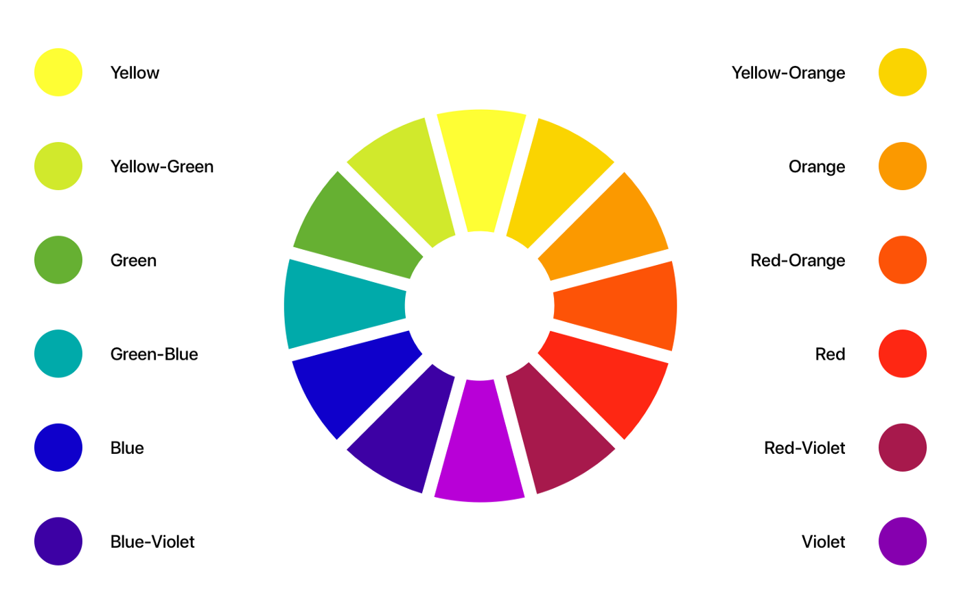
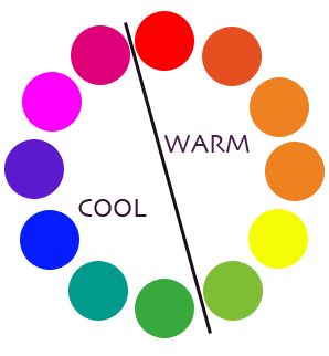
Color Wheel
The color wheel shows the relationship between different colors through different colored sections. The color wheel usually consists of primary, secondary, and tertiary colors. The primary is those three pigment colors that any combination of other colors can not form. Mixing 2 primary colors form a secondary color And tertiary are formed by mixing any primary and secondary colors.
The first color wheel was presented by Sir Isaac Newton in the 17th century when he first discovered the visible spectrum of light. Around this time, color was thought to be a product of the mixing of light and dark, with red being the “most light” and blue the “most dark.” Since then, the color wheel has undergone many transformations but remains the primary color combination tool.
Colour theory is a vast and fundamental topic for all designers. But Hue, Saturation & Temperature are ways to describe a color.

What is hue in colors theory?
Hue is a pure color without mixed white, black, or grey.
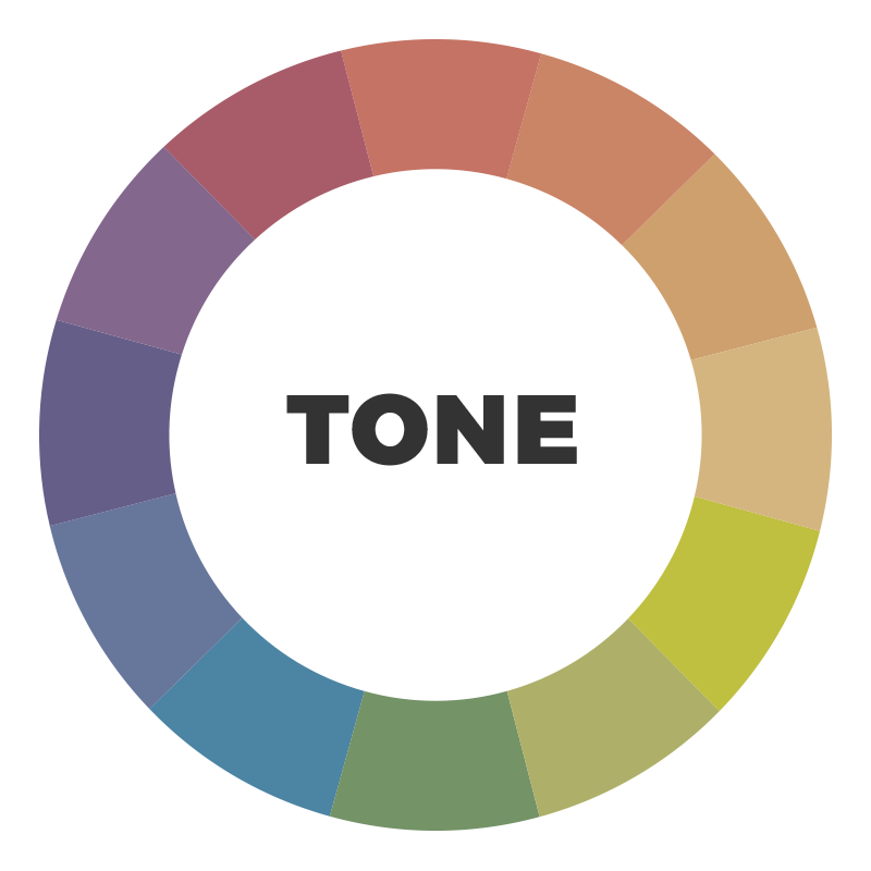
What is tone in color theory?
A tone is added to a color when black is mixed with any hue.
What is tint in color theory?
When white is mixed in any hue, it adds a tint to that color.

What is shade in color theory?
When grey is mixed in any hue, it adds a shade to that color.

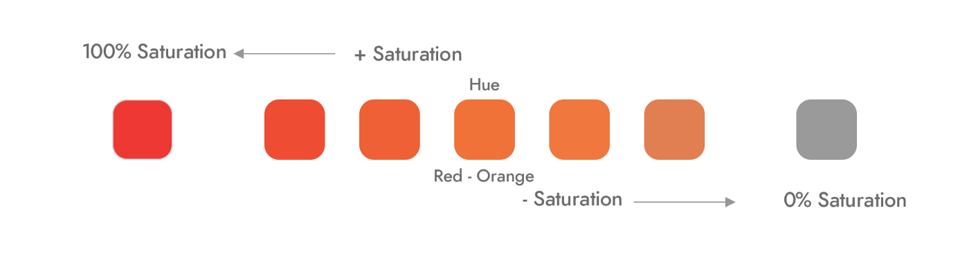
What is saturation in color theory?
A pure color has 100% saturation and medium grey color has 0% saturation.
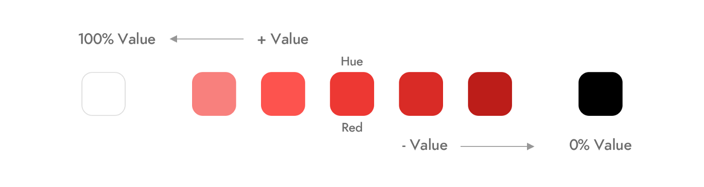
What is value in color theory?
A color with a lower value has more white mixed to it, so it has a higher tone. And color with a higher value has more black mixed to it, so it has a higher tint.
What is the color temperature in color theory?
A warm color has a higher color temperature. A cool color has a lower color temperature.
Color Values
Dark Colours: Higher-value colors are darker. They represent conservatism and stability, control, boldness, etc.
Light Colours: Low-value colors symbolizes playfulness, creativity, sophistication, and desirability.
Color Categories
There are six main generally recognizable color categories. For deriving these different color categories, we need to focus on adjusting the levers of Hue, Saturation, and Brightness.
1. Jewel tones
These colors have more saturation hues named for gems, including sapphire blue, Ruby red, amethyst purple, citrine yellow, and emerald green. These colors are regal, deep, and impart a sense of luxury.

2. Pastel tones
Pastel colors belong to the pale family of colors. Pink, mauve, baby blue, light purple, etc. are common pastel colors. These colors have another name “calming colors”. Decreasing the saturation and adjusting the tint creates pastel colors.

3. Earth tones
These colors are usually present in mother nature. Most earth tones generate from clay pigments like ombre, ochre, sienna, etc. Combining a pure hue and a neutral color creates earth tones. The tones of trees, forest, seas, sky, and earth inspires this color category.
These colors generate by increasing saturation and adjusting the tone.

4. Neutral tones
Pure neutral colors consist of black, white, beige, and all types of greys, while near neutral consists of browns, tans, and darker colors. Decreasing saturation creates earth tone colors.

5. Fluorescent tones
Photoluminescence results in fluorescence. Phosphorescent colors emit light when excited by visible or ultraviolet light. We get this effect by applying very bright and highly saturated colors to our designs.

6. Shade tones
The 2 primary shades are black and white. These colors are generally absence of light and dark.

Conclusion
Color theory is a massive part of any product design. Creating a good color scheme is about matching and balancing hue, tint, tone, shade, temperature, saturation, and brightness. You must know which levers to pull to do this in your design apps.
For any questions and inquiries, visit us at thinkitive


Your article made me suddenly realize that I am writing a thesis on gate.io. After reading your article, I have a different way of thinking, thank you. However, I still have some doubts, can you help me? Thanks.
The point of view of your article has taught me a lot, and I already know how to improve the paper on gate.oi, thank you.